


How to Make Your Practice Website Look Modern
Nowadays, style and design evolve and change almost as quickly as technology. When you first put together your website it looked shiny and contemporary, but you may have found yourself staring at it recently and wondering, “Why does my site look so ‘old’ now?”
Figuring out the aesthetic nuances that your brain reads as “trendy” or “outdated” can be a really hard thing to do on your own. Seemingly tiny elements like your font choice or the color of your menu combine to create an overall ‘feeling’ that our brain interprets as a singular tone – whether that tone is hopeful, calm, active, stuffy, childish, or anything else.
–> Wondering if your website is up to par? <–
Run it through our free Website Grader!
So what are the concrete changes you can make to your website to make it look more “modern”?
Lucky for you, you came to the right place to get some answers.
Why is it beneficial to have a modern looking website?

Before we get into details about the “How,” it’s important to understand the “Why.”
So why update your practice website’s design?
The short and powerful answer is that your potential clients will love it. Modern web design trends are popular for more reasons than the “Ooo!” and “Ahh!” effect that a beautiful website can have on your visitors.
Contemporary design was engineered to look particularly good on all of the little screens we carry around nowadays, providing us better readability and increasing the speed at which we can zoom around Internet pages.
Not to mention, having a mobile friendly site (an essential part of modern website design) will make your website much more accessible to the untapped audience of your potential clients who use their smartphone much more than a full-sized computer.
How to Make Your Practice Website Look “Modern”
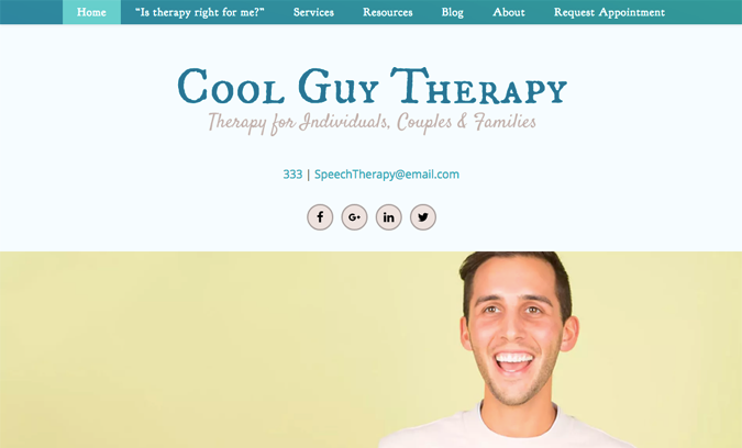
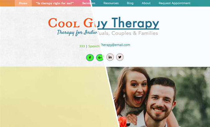
Meet “Cool Guy Therapy,” our pretend practice website.
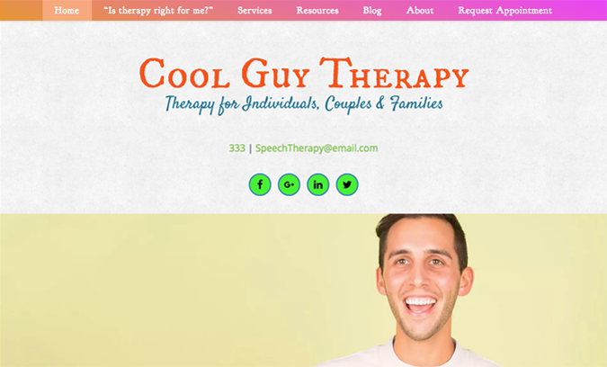
This website has all of the functionality that a modern site needs, but it still doesn’t look “right” – that is, it doesn’t look very current. As we start going through our design tips, we’ll use Cool Guy Therapy to see how small changes can dramatically improve our visual impression of this website.
Colors

Your color scheme is one of the most impactful decisions you’ll make about your design because it affects every area of your site. The colors of your website will hit website visitors before any other design elements.
While it may be tempting to simply choose your favorite colors, not all colors look great on a website – and even fewer colors look great on a therapist’s website.
• Keep it simple.
When you don’t have experience as a professional designer or artist, it can be difficult to gauge how certain color palettes will look to other people who don’t have your same likes and dislikes.
A popular way to avoid a chaotic or mismatched color palette is to keep it super simple and pick only 1-2 main colors from the color wheel (a.k.a., not neutral colors) for your theme.
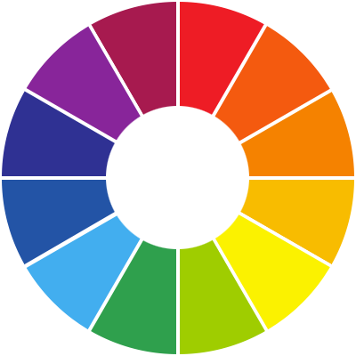 Standard colors on a classic color wheel.
Notice how you don’t see any neutral colors like black and brown?
Then once you have your main colors, you can keep your color scheme clean and straight-forward by completing the rest of your color profile using neutrals such as whites, browns, tans, creams, grays, or blacks.
• Keep it cool.
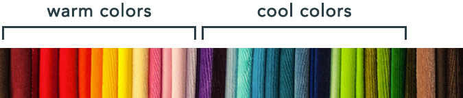
When a potential therapy client visits your practice site for the first time, you want them to feel peaceful, hopeful, relaxed, and maybe even contemplative. Cool colors (blues, greens, and violets) are a great way to get this point across right away.
Warm colors like reds, oranges, yellows, and pinks appear more active and energetic and will give a more playful or restless feel to your site. This may actually be appropriate if your practice focuses on young children clientele and/or play therapy, but otherwise we highly suggest using a cool hue for the main color* of your website color scheme.
*If you are using “complementary colors” for details in your site design (explained more below), it’s likely that you will have a mix of cool and warm colors on your site. We simply suggest that that the most prevalent color is still a cool color.
• Keep it complementary.
An option you will want to consider as you’re putting together the color scheme for your website is using “complementary colors.” When colors are complementary, it means that they look particularly good together, as if designed like that by nature. These are pre-existing color pairs that you can use to really make your color scheme pop!
So how do you find complementary color combinations for the colors you like? Simply look directly across the color wheel.
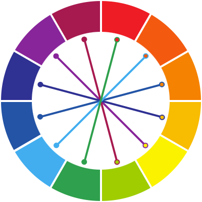
You may have noticed that complementary pairs tend to contain one cool color and one warm color. So how do you use complementary colors if you still want the overall impression of your site’s color to be cool tones?
Simply use the warm color in your complementary pairing for coloring details on your site (links, text highlighting, titles & subtext, small buttons, footer area, etc.) and continue to use your cool colors for the main coloring on your site (menu background, logo, important titles, large buttons & objects, etc.).
• Keep away from neon.
I know, I know – neon colors might be fun for you to wear or display on a poster, but I can’t stress enough that you should never use neon colors on your website.
Neon colors appear as vibrant as they do because of an optical illusion that makes the edges of the color appear fuzzy or “glowing” to our eyes, as if the color was naturally lit up like a lightbulb. However, when you combine this effect with an electronic screen (which is a light source itself), you get an unattractive, eye-stinging glare.
Let’s apply these new color tips to our example website, Cool Guy Therapy.
What a difference a simple color change makes! This site is already more attractive and more modern looking, but it’s far from finished so let’s keep going.
Fonts
 Font choice is another one of those areas where it can be tempting to simply select fonts that make you happy or that you like personally. Just like colors, however, not all fonts work well on a website.
• Select a group of fonts.
We talk to a lot of customers who worry that using more than one font will star to make their website look confused. The truth is when you select the correct fonts, using more than one can be very healthy for your design.
While your titles and headings will probably all be in the same 1-2 fonts, you should pick a few different fonts for your whole website that appear somewhat similar to each other. Think of it like this: try to pick out fonts that look similar enough to be cousins, but not so similar that they’re twins.
• Stick to “sans serif.”
Did you know that certain fonts are designed to read better on screens? The main difference between those fonts – and fonts that aren’t designed to be read on a screen – is whether the font is a serif font or a sans serif font.
Serifs are the little “feet” or protrusions that appear sometimes from the ends and corners of letters. View the example text below in Times New Roman – a classic serif font – to see where we’ve circled some of the serifs.
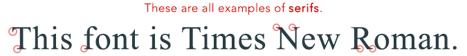
Serifs are very helpful when you are reading on paper and not on a screen (such as when you are reading a book or the newspaper) because they guide your eyes along the current line and help you skip quickly to the next one. However, serif fonts like the one above can become a strain on the eyes over time when used on screens.
When selecting fonts for your website, you want to stick primarily to fonts which are sans serif (a french phrase which means, “without serif”). For example, the font that this blog post is using is a sans serif font. Sans serif fonts are easier to read on a lit screen and allows our eyes to read text in a glance when we are scrolling rapidly through content.
• Never use Comic Sans.
Look, I know that Comic Sans is technically a sans serif font, and it’s one of those whimsical fonts that appeal to the inner child in many of us. It’s because of these facts that Comic Sans has become infamous for its extreme overuse during the 20+ years since its release by Microsoft.

If you’ve never heard this about Comic Sans before, you may be thinking, “How big of a deal can it be? If it’s still a sans serif font, whether or not to use it is just a matter of opinion, right?”
Well, let me put it this way. Using Comic Sans is a bit like wearing socks with flip flop sandals to church. There’s nothing inherently harmful about it, but I’m betting 9 out of every 10 of people around you are going to have a strong, negative opinion about it.
–> Worrying MORE about what you’re writing than your font? <–
Sign up for our free Virtual Blogging Assistant!
So what happens when we apply our new font advice to our example site?
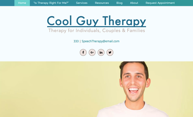
It’s coming along nicely! Let’s move onto talking about photo selection and make this site even better.
Photos
 Your photos should be tailored to reflect elements about your specific practice or specialty, but that doesn’t mean that there isn’t advice that you can use to help guide your photo selections.
• Try a selective focus.
“Selective focus” is the photography technique of focusing the camera on only one area or object in the photo, leaving the other areas of the photo fuzzy and out-of-focus. When you choose photos that use a selective focus, they add interest and depth to your photos in a way that helps your site feel slick and modern.
To see a little more of what I mean, let’s take a sneak peak of how we can change the main photo on our example website. Right now, we’re looking at this smiley guy.

Happy as he may be, this isn’t a very interesting photo on its own. It feels empty because there isn’t anything for us to look at in the background, and it feels staged because of the unnaturally solid backdrop.
Let’s choose a different photo of energetic smiling people, but this one will have a more dynamic, selective focus.

Right away, this photo feels more engaging and interesting. There’s more for us to look at and the background feels fuller to our eyes, even though it’s too unfocused to make out specific objects. That same selective focus also makes the subject of the photo (the people) feel more emphasized and important.
• Don’t settle for less than HD.
Because of all the differently sized and shaped devices that your website could be viewed on today, using only High Definition (HD) photos is more important than ever.
When you choose photos that are HD, they’re going to blur less and look better on a larger variety of screens. Another common way of describing photos that are HD is “high resolution,” meaning there is a higher number of pixels in the photo, allowing us to see more details. Look what happens with our new site photo when it doesn’t have a high enough resolution.
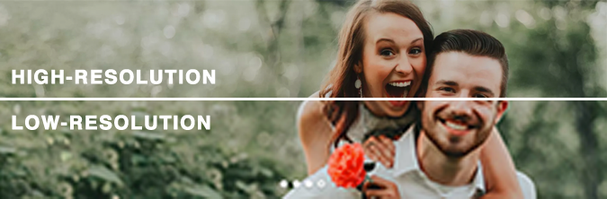
Do you see how the “Low-Resolution” image on the bottom half has started to become fuzzy and slightly pixelated around the people? Those are warning signs that you need to use a bigger, HD version of that photo (and if that’s not available, you should choose a different photo).
A little confused? Don’t worry! If you use a professional stock photo website to find your images, every photo should already be high resolution so you don’t have to worry. To get you started, a couple of our favorite free stock photo sites are Unsplash.com & Nappy.co.
So how is our Cool Guy Therapy website looking when we put it all together?
The difference is like night and day! When we compare the old design directly with the new one, we can see how much more modern we made this design with some tiny tweaks. And now you know how easy it is to do for your own website!
You just have to take it step by step. 🙂
More Quick Tips!
We’re not done yet! Before you run off to give your own practice website the Hollywood treatment, here are a few more hot tips to stick in your pocket.
• White space is your friend! Gone are the days of needing a textured backdrop or background image on every single inch of your site. Don’t be afraid to let some of your website elements stand on their own with a white background.
• Don’t worry about “above the fold.” Earlier in the 2000’s, you may know that it was more important for websites to put their essential information “above the fold” (the top area of your homepage that your screen shows before you start scrolling). However, today website visitors are so used to scrolling that they’ll start to do it automatically, eliminating the need to cram all your important information into the top section.
• Make sure you’re mobile optimized! I can’t stress this one enough. Like I mentioned in the beginning of this article, mobile optimization is an essential part of a modern website. Your potential clients will expect you to already be mobile optimized, and you’ll lose traffic and interest if your smartphone-only customers have to struggle to use your site on their small screens.
The bad news is that mobile optimizing a website typically takes a certain coding skill level, so it can be difficult to do to your own website without training.
But you know the good news?
If you become a Brighter Vision customer today, we’ll mobile optimize & Search Engine Optimize your new custom website for FREE.
Learn more by filling out the form below, and our customer happiness team will reach out to say ‘hello.’