


The Practice-Changing Magic of Tidying Up (Your Website)
In this day and age, everyone knows convenience is king.
If a business or product expects its customer to do all the work, it will not stay profitable for very long. Yet when it comes to your private practice website – a website you have fretted over, picked at, and tooled with for so long it starts to feel like your child – it is all too easy to develop a blind spot.
We can get so desperate to make sure the perfect client visiting our site doesn’t get away that we try to make sure every possible concern or question has an answer provided on your site. Pretty soon, your therapy site is a bird’s nest of too many specialty pages, links to other sites, inspirational quotations & exercises, FAQs pages, legalese, and other junk that nobody is ever going to read.
Need help marketing to your Ideal Client?
Find new ways with our Ideal Client Quiz
Why Your Clutter Is Driving Away Clients
When you jam-pack your website with too much information and content (no matter how useful it may be), your website becomes much more difficult to navigate. Not to mention, a lack of organization can make your site look sloppy and unprofessional.
Visitors can quickly become lost or frustrated when the information they are looking for isn’t where they think it should be. They may lose interest when what should be a 15-second query turns into a 10-minute read because you chose to get flowery with your services page.
What I am trying to say is, if you overwhelm your website visitors with clutter, potential clients will leave your site.
All of us are guilty of abandoning a site when it suddenly becomes too much work. Nowadays, site cleanliness and organization isn’t only about how visually “simple” or “busy” your site is – it’s also about creating an experience and a path for your website user that is also clean and organized. So, how do you keep your website guests from fleeing?
Pull up your yellow rubber gloves and grab a soapy sponge – we’re about to start a website deep clean!
Tidy Step One: Navigation
One of the most common areas of clutter on a website is the navigation menu. Our anxiety takes over and tells us that we need to put EVERYTHING in the main menu or else the website visitor will never what they need. But, the truth of the matter is, your visitors are far more web-savvy nowadays, and they don’t need to have everything laid in front of them.
You can take advantage of their savvy by adding drop-downs to your main menu items. By “drop-down,” I mean the expanded menu options that often appear when you hover over or first click on the main menu item with your mouse. For example, here are the drop-down options available when you mouse over the main menu on this site.

Website visitors will intuitively understand this responsive function and automatically hover over the menu items to see if there are drop-down selections. Following this thematic approach and combining like menu items can save a TON of space on your main menu.
For example, take a look at this jam-packed website menu:
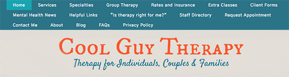
Woof, what a mess!
To the average website visitor unsure about picking a clinician, that menu certainly doesn’t make you look like a professional option. And, oftentimes, that’s all the excuse they need to “X” out of your website and move on with their day.
Let’s try employing the drop-down menus we just talked about by grouping these items into categories.
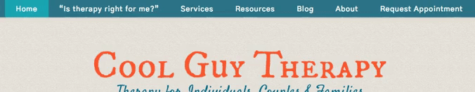
What a difference that makes! The website already looks more professional and much more organized. It no longer feels like your eyes have to race around the screen to find one particular link.
When you group your main menu items to help clean up your site, it also helps guide visitors to the answer they’re searching for more quickly by starting with broader topics and narrowing to more specific queries via the drop-down menus.
Here are a few other tips that will help to keep your website menu in tip-top shape.
Keep It to One Line
When you view your website on a full-screen window (its natural/optimal size), you should never have a second line of menu items on your screen. For example, in our cluttered menu example above, the menu items actually wrapped around to a third line! You always want to do what you can to fit all of your main menu items on one line. However, just making the font smaller is not the way to go because…
You Don’t Need More Than 5-7 Items
Now without counting drop-down items (so only considering the main menu items that you can always see), it’s a good rule of thumb to try and keep your top tier menu items to around eight or less. There are ways to qualify for an unofficial exception to the rule – such as if your menu items are all so short that it’s easy to fit in a couple more – but it’s still not advisable to go over ten main menu items, or under four.
Try to Keep It to 2 Words or Less
In general, it’s a good idea to keep your menu items to two words or less, not counting conjunctions or prepositions, like “and” or “the.” Obviously, this is more of a ‘soft’ rule – we already broke it once in our drop-down menu example! But it’s a great guideline that 90-100% of your menu items should follow to ensure that your menu stays squeaky clean overall.
Tidy Step Two: Homepage
Ideally, your homepage shouldn’t need much cleaning in the first place. It’s supposed to be an area for website visitors to become introduced to your practice and be presented with different options to find more information. So, the material presented on this page should be short and sweet.
However, in our good-hearted effort to put all of our best stuff out front, a homepage can easily become a display case for everything we’ve ever written or everything good you’ve ever accomplished or earned.
A truly tidy homepage is about clear, concise sections and leaving the elaboration to your more dedicated website pages. You want to create something akin to an appetizer sampler – little bites of the different available options, without one particular option crowding out the rest.
To understand these ideas in action, let’s look at a wonderful example of a private practice homepage, Early Childhood Wellness Place.
If you have a cluttered homepage, chances are the bulk of it is in the textual portion that serves as the introduction to your site. It’s easy to feel like you need to pour out your heart in that one section to sell yourself – to ensure that potential client is really going to understand that you’re the perfect option. Unfortunately, that visitor – that potential client – disagrees.
Website visitors like to click and do – they don’t like it when they have to spend too much time on one page. The good news is that you have plenty of other space on your website to host all that writing you want to do (you can always make more pages to put in your drop-down menus!).
Early Childhood Wellness Place has already cracked this code. They have written a truly concise yet informative and ear-catching introduction for their homepage.
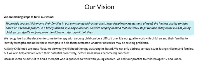
Notice how they didn’t unnecessarily elaborate on their specific therapeutic methods or go into too much detail about their personal feelings or passions. They have delivered only the basic and essential information in a voice that is still thoughtful and caring. That’s all they needed to do.
Hot tip! Avoid having any individual segments on your homepage that take up more than a screen’s worth of space on a computer monitor.
The same practice also does a great job with the rest of their homepage by creating sections where they link to a few of the most important (or more helpful specialty pages) on their practice site.

Notice how they used photos that accurately depicted each topic, telling the viewer more about the individual choices than their titles alone. Using pictures to create meaning – instead of mounds of text – is one of many intelligent ways to clean up not only your homepage but all pages of your website.
Remember, whenever possible, show instead of telling.
One more essential step to cleaning your homepage is to make sure you have obvious CTAs (calls to action). A call to action is anywhere you ask your website visitor to take action, and then give them a link to do just that – i.e. “Schedule an appointment,” “Download my book,” or “Contact me for a consultation.” It’s important to have CTAs throughout your homepage since it is the central navigation hub for your website.
Website visitors turn back to your homepage whenever they’re in need of a fresh start, like if they have a question and don’t know where to start looking for the answer. You definitely want a place like that to have a way for your potential clients to reach out as soon as the mood strikes.

Early Childhood Wellness Place does it again with a beautiful, eye-catching CTA that is sure to attract the eye of any potential clients looking for a way to reach out.
However, don’t feel like you need to make your CTA as prominent as theirs – especially if you aren’t super confident in your design skills. Many sites accomplish the same thing by adding a bolded invitation to reach out or a prominent button at the end of their homepage introduction with a helpful link, like this example from another practice, The Refinery.

Need some help writing content for your homepage?
All Brighter Vision packages include our Homepage Generator! Find out more by reaching out today.
Tidy Step Three: Header
Our third and final step in this de-cluttering crash course will focus on the very top and bottom of your website – the header and footer.
Like with your homepage, cleaning up your header/footer sections are as much about what should be there as what should not.
Your business logo and navigation menu are the most commonly known features your header should include in one way or another. This is even true of the mobile version of your website – although your menu probably folds down to a little button in the corner while on a mobile device. What many forget to put in their header, however, is the one thing that most people are really looking for: your contact information.
Whether you are using a mobile device or a full-size computer monitor, the header (and footer) is a well-known “quick-hit” area meant to give you the most critical information right when you need it.
The header is the first thing a website visitor sees, and it is the first place they will check when they are looking to get in and out of your site very quickly. For example, if they are simply looking for a way to reach out to you, such as via your office phone number and/or email address.
On a mobile phone, this effect is amplified even more with website visitors needing quick-access information right in the header, so they don’t have to scroll all over your site on a tiny screen to find it.
Keeping these two easy sources of contact information in your header helps to keep your site clean and professional because it provides a one-click convenience that is clean and professional. (Remember: Tidying up your site isn’t just about the visuals, it’s also about how clean and straightforward the user experience is for your website visitor.)
And of course, the real key to keeping your header clean is realizing that these three pieces – your logo, your main menu, and your contact info – are all you should need in your private practice website header. When it comes to your website design, always always remember that overdoing it can be just as dangerous as under-doing it.
Want the beautiful therapist website you deserve? Then you’re in the perfect place.
These were only a few first steps to get you started on your private practice website cleanliness, but I bet your site is already looking shinier and cleaner. How did it feel? Are you excited by the new cleanliness of your website? Or are you just exhausted by all the editing?
If the latter sounds more like you, never fear! We are pros at taking care of everything when dealing with your private practice website starts to feel like too much.
Reach out to our customer happiness team today and learn how one of our custom-built websites can help you grow the practice of your dreams.