


Dear BV: How Much Content Do I Need on My Home Page?

“Dear BV” is a marketing advice series that answers the most popular questions from real Brighter Vision customers. Want to see your question answered in an article of “Dear BV”? Reach out to us on Twitter or Facebook!
At Brighter Vision, our top priority is customer happiness. We’re constantly working to improve our own processes all-the-while working to provide our clients with as much information as possible on how to grow their practice. So when we’re asked a really great question, we can’t help but want to share the answer with everyone. And that’s exactly how our “Dear BV” series came to fruition.
So, without further ado, the question we’re answering today is…
This is an excellent question and we’re more than happy to chime in on this one :).
Finding the perfect balance between “too much” and “not enough” can be tricky when it comes to your home page’s content. You want to make sure you’re giving your visitors what they’re looking for and answering all of their questions, but you also don’t want to overwhelm them with too much information all at once. And don’t even get me started on giving the search engines what they’re looking for!
Here’s the short and sweet answer to the age-old question, “how much content do I need on my therapist website?” – You want to have as much relevant content as possible to please both your human visitors and search engines alike. But, what’s even more important is that you organize that content correctly.
Now, let’s examine both parts of this answer in further detail.
Not sure if your website has everything it needs?
Test it yourself with our FREE Website Grader quiz!
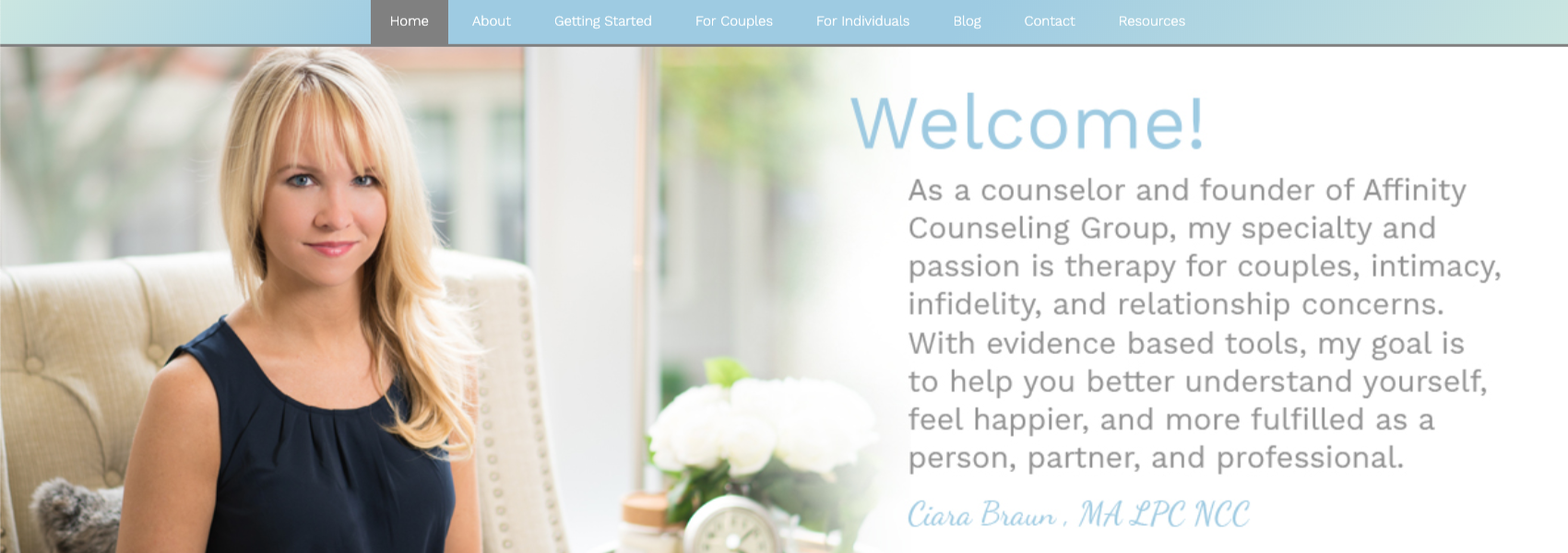
Your home page is the most visited page on your private practice website, so you should put a good amount of thought into its design and message.
The first thing your home page content should do is call out to your ideal client. So, the first step to writing content for your home page will be defining your ideal client. Who are they? What are they struggling with? And, most importantly, what are they looking for on your website?
Once you have answered these questions, you can use this information to create content and design a home page that will really resonate with the right audience.
What Not to Do
Some of the (let’s just call them) simpler website-building platforms try to encourage people to build websites with as few pages as possible, cramming far too much content onto just a few pages – or even one long run-on home page. They justify this by saying it’s “easier for visitors to understand your business as a whole without getting lost in a maze of other pages.” However, we’re going on the record right now to say this is a terrible idea.
A home page with too much content (or any other page on your website, for that matter) can quickly become overcrowded and busy looking. And, trust us, stressing your visitors out with content overload will turn far more people away than making them click to another page on your site to find the answers they’re looking for.
Need help marketing to your Ideal Client?
Take our Ideal Client Quiz now to receive your custom marketing tips!
If you’re interested in learning more about why you don’t want a single-page website for your private practice, check out our post on why single page websites are bad for SEO.
What to Do
Most people look at the home page of a website exactly as they would a magazine cover – quickly scanning for clues about whether it’s the best choice for them.
You want to follow the same magazine cover concept with your home page content and overall design, giving potential clients only what is needed to convince them that you’re their best fit therapist. And, at the same time, refraining from saying too much and unintentionally putting doubt in their minds.
To strike the right balance, give visitors a brief introduction to your practice, who you serve, and the services you provide. Ask yourself, “what are the top 5 or 6 questions that visitors will be landing on my website looking to have answered right away?” and that’s what should be on your home page – nothing more, nothing less.
For most practices, this means you’ll definitely want to make sure you’ve included the following in your home page content:
1. A short and sweet introduction
Using what you know about your ideal client, craft a short introduction that will grab their attention, and resonate with them right away. Be sure to use trigger keywords that they’ll be looking for on your page. Write about you, but make it about them. For more on how to do this, click here.
2. A list of your specialty services
Again, don’t go into too much detail here. This should, once again, be easily scannable so that visitors can find what they’re looking for within a few seconds of being on your page. Stick with a bulleted list or featured image boxes that are obviously linked to individual specialty pages where they can click to learn more about each particular service. For more on how to write content for your specialty service pages, click here.
3. Your contact information
Some visitors have clicked through to your website just to find out how to contact you, so your phone number and email address should be easy to find and included a few different times throughout every page on your website (i.e. in the header, within your content, and in the footer).
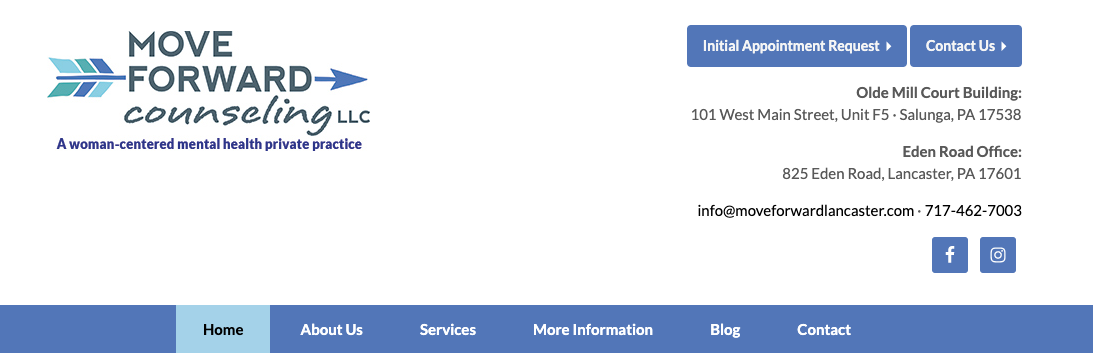
4. Your office location
If you provide in-office therapy, your location information (your street address and, if possible, an embedded Google map) should be just as easy to find as your contact information.
5. A few calls to action (CTAs)
Now that you’ve caught and kept their attention, it’s time to guide your visitor towards the next step. After each section, tell them what action you want them to take now and make it easy for them to know exactly do it. For example, if you want them to call your office to schedule an appointment, add a button or link that says, “Call Today”.

Looking for more super-charged marketing tips?
Use this form to take our e-course on 8 Unconventional Ways
to Market Your Private Practice!
How to Organize Your Content
Your home page is different than any other page on your site in that people expect to learn a lot about your practice and determine whether you’re a good fit for them, within a few scant seconds.
To ensure your visitors can easily recognize any and all key information within your home page content, you can use the following tips to place emphasis where it’s most needed:
1. Break content up into smaller sections
As we’ve already said, nothing will make a visitor leave your site faster than a single, dense page of run-on text. It’s important to keep your paragraphs short and concise so you don’t lose your readers’ interest. As a general rule of thumb, try to keep each paragraph on your page between 2-5 sentences long.
2. Break things up with headings (and subheadings)
Headings and subheadings are wonderful things! They act as an outline for your entire home page to show your visitors what to expect from each of your content sections. By breaking up your home page into obvious sections, you’re making it easier for visitors to perform a quick scan and find the exact content that they’re looking for.
3. Place emphasis on keywords in your content
Make the most important terms stand out within a paragraph by making them bold, italic, underlined, or changing their color. This is especially helpful when you have multiple keywords within the block of content that don’t each need their own full home page section.
4. Change up the standard layout by using lists
Putting things into bulleted or numbered lists is another great way to help break up the content on your page into smaller chunks, and help place visual emphasis when it’s needed.
- They’re extremely simple to add with your content from your page editor, much like you would in an email or word document.
- They often attract visitors away from a standard paragraph and to your list, offering them a greater chance for visibility.
- They help break up the presentation of your content.
5. Organize everything else within a simple & intuitive navigation menu
As you’re reviewing the content you’ve included on your home page and deciding what’s absolutely necessary versus what can be trimmed down, any content you remove likely still needs to be posted on another page further into your website’s architecture. After all, you want to give visitors all of the information they’re looking for on your website – just not necessarily on your home page.
So, to ensure any visitor will be able to find what they’re looking for quickly and easily, you need to have a well-organized navigation menu. Your main menu should only include the absolute highest priority and top-level category headings, followed by drop-down lists of specialty pages that fall under those categories.
For example, let’s say you have 6 different specialty service pages on your website. You wouldn’t place each of these individual pages in your main menu, right? Of course not! Doing this would cause as much stress and reduce the overall user experience almost as much as an overcrowded home page.
Too much information – no matter where you’re talking about on your website – is never a good thing. Whether you’re writing content or organizing that content into an easy-to-follow navigation menu, remember one thing: KIS (keep it simple).
Final Thoughts
Remember, your private practice website should give visitors a positive user experience. Potential clients should be able to find exactly what they’re looking for when they land on your home page and, hopefully, contact your office for an appointment.
If you need help crafting a fantastic therapist website with the perfect home page content, Brighter Vision would love to help. Schedule a call with a member of our team today for a free demo of our new virtual design intake.
Want the beautiful therapist website you deserve? Then you’re in the perfect place.
Brighter Vision is the ultimate marketing package for therapists, centered around the best therapist website you’ve ever had. Fill out the form below to learn more about our team of professionals who can’t wait to help your practice grow like never before 🙂