3 Myths About Web Design Your Private Practice Should Forget
Mom always said, “Don’t believe everything you read on the internet.” And as it turns out, she was right.
There are a great deal of web design myths floating around the internet, and we believe that as a mental health professional, you shouldn’t have to worry about educating yourself on every falsehood out there.
That’s why we’re shattering three common web design myths and revealing their truths, just for you.
Most are antiquated and some should’ve been tossed from you brain years ago, and yet, subscribing to these myths can actually hurt your website design, and in turn, hurt your private practice as well.

Myth #1: People Don’t Scroll
For the longest time, “above the fold” has been embedded into our heads. Meaning, we made sure the goods — the important information — was instantly seen on the page without having to scroll down.
But now, people scroll inherently.
65% of attention on a web page is spent below the fold, and on mobile, 90% of users start scrolling within 14 seconds of viewing a site.
The design agency Huge measured scrolling in series of tests and surveys. They found that “participants almost always scrolled, regardless of how they are cued to do so” as long as the content above the fold was engaging enough for them to keep reading.
Potential clients will scroll, as long as they’re engaged enough to do so.
How can my website encourage scrolling?
Two ways: visual cues and compelling content.
Visual Cues
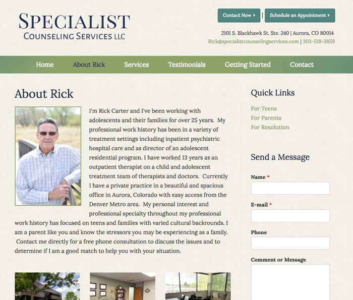
You probably have visual cues on your website already that you haven’t noticed. The most common practice for these are cut off text and photos. This encourages the user to continue scrolling down the page and shows that there is more content to be found below.
Rick Carter does a great job with visual cues on his private practice website, shown below.

Compelling Content
Compelling content is content that resonates and matters. Content that resonates with your potential clients is content that makes your audience seem like you’re writing for them. Content that matters is content that makes the readers feel something. And when they care about the content, they’re driven to take action.
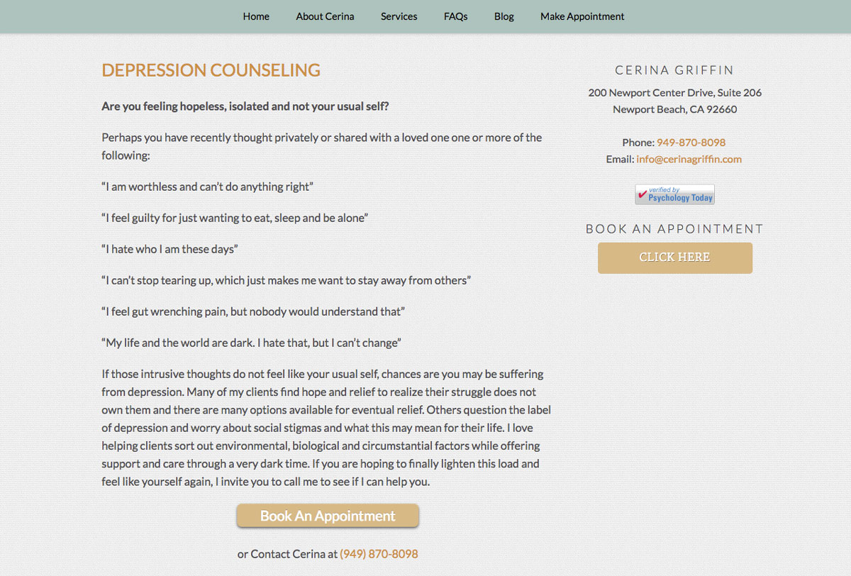
Pro Tip: An easy way to create compelling, engaging content is to ask the audience questions. Cerina Griffin does a great job with this one.

Myth #2: White Space is Your Enemy
Let’s get one thing straight: White space is not your enemy. It’s your BFF, your partner-in-crime, the person you call after a nightmare. Learn to love your white space.
What is white space? White space is defined as the empty spaces in design, used to “separate disparate design elements and group smaller ones.”
And white space isn’t always white, either. It’s the empty parts of the page. So if your website has a background color other than white, that color will be the color of your white space.
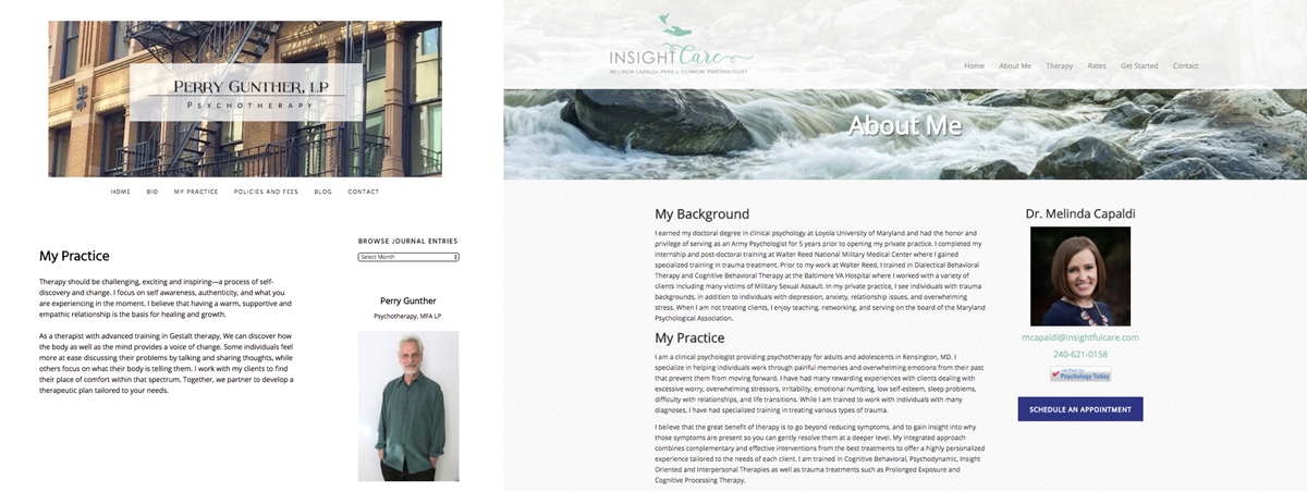
Let’s take a look at Perry Gunther’s and Melinda Capaldi’s websites below. Notice how they embrace white space in different ways.

Perry and Melinda both utilize white space on their websites in different ways, yet gain the same advantages of using it.
What are the advantages of using white space on my website?
A Tidy Site is an Impressive Site
First impressions matter. A lot. When white space is used to break up your content, calls to action and contact buttons, your website is easier to navigate and has better presentation over all. To get your message through and make a potential client act on it, white space is key.
Highlighted Calls to Action
Web user behavior is constantly changing and evolving. And experienced web users tend to ignore banners and, not surprisingly, graphics that look like them. White space can help make your calls to action stand out to ensure users don’t snub them entirely.
White Space Creates Balance
Too little white space can lead to disorganization and confusion, which can lead to a potential client leaving your website. Implementing white space onto your site will give potential clients direction and clarity because white space acts as a separator between content, images and calls to action.
Effective white space keeps a website organized and creates harmony and balance. So get rid of that “white space = blank space” mentality. Embrace the space.

Myth #3: The Homepage Matters Most
An engaging, interesting homepage is crucial. It draws the user in and often showcases your private practice.
You’ve picked out the perfect photos and inspirational quotes, and you have a great call to action. Your “Contact Me Today!” button has the best colors that compliment your logo, and your bio photo is personable and you look great.
From your homepage, users want to learn more, and venture onto other pages within your website. So we know it definitely matters, but it’s not the only thing that matters.
In fact, your inner pages matter more.
But why isn’t my homepage the most important? I mean, it’s the homepage!
Your homepage isn’t necessarily the first page a new user lands on. Users, or potential clients, can arrive on websites through various links they find through search engines, newsletters, referrals, social media, emails, advertising, and other channels.
The inner pages of your website are important because they hold the “meat” of your website.
… What “meat” are you talking about?
Your content! The inner pages of your website generally hold much more in-depth, informational and helpful content. Whether it’s the types of services you offer, explaining your niche or introducing yourself on your “About Me” page, this content is usually more engaging than the welcome message on your homepage.
According to Audience Bloom, after your homepage is set up the way you’d like, you should focus on your “About” page next.
If a user wants to get more information on your private practice and staff, they’ll head to your about page. Here, you’ll have the chance to tell your story and paint a picture of how your practice works for your potential clients.
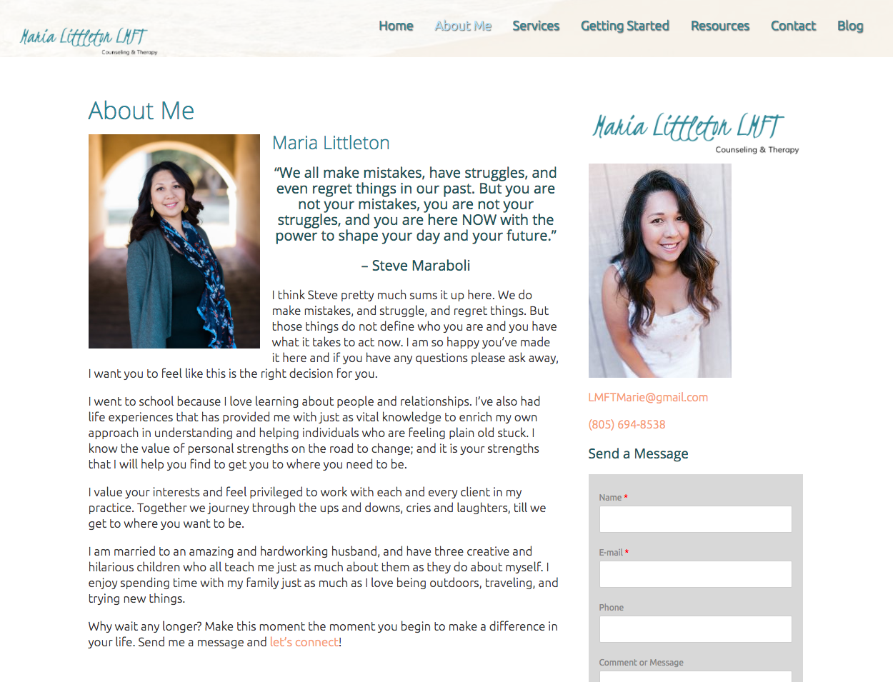
Pro Tip: On your “About” page, focus on what makes your private practice unique, what makes you different from other practitioners in your niche and what makes you valuable. Maria Littleton does an amazing job including personable and transparent content on her “About Me” page. Check it out below.

Give your private practice’s website a glance and take the myths we’ve just busted into account.
Does your website have white space? Is it easy to navigate? Have you put as much energy into your inner page’s content as you have your homepage? Are you asking engaging questions like we are right now?
We’ve given you the rundown, now it’s your turn to implement our tips and fine tune your already incredible website.
And remember: Everybody scrolls, white space is your BFF and inner pages matter, too.
>> Do You Want More Clients? >>
Sign up to receive a Free Trial of Brighter Vision & start getting more clients!


