


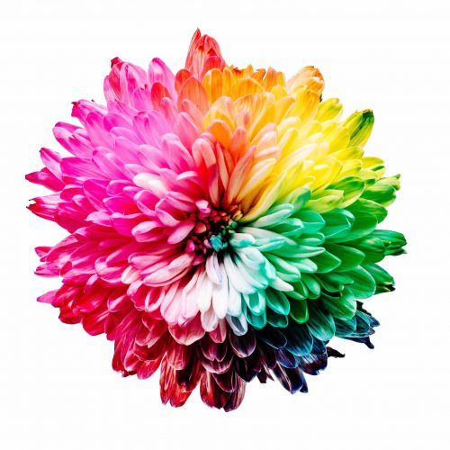
Can Website Colors Boost Profits and Success?
Have you ever given much thought to color and the impact it has on us as humans? As a therapist, you understand the intricacies of the miraculous mind, so maybe you have.
But…
Have you considered the possibilities of harnessing color psychology on your website? No? I’m glad you’re here because its potential is profound.
There are a raft of reasons why you need to be aware of the colors in website creation; from standing out and branding, to appealing to your demographics, to how your practice is perceived, and even how much profit you will make.
There is much talk on the net about color, much of it mere opinion when evidence is required. In this article, we delve into the research to bring you helpful answers.
Are you ready to see how shade selection could transform your practice?
Building your brand
Often when building a brand — and remember, whether or not this is a considered decision, you are building a brand — we consider name, logo, prices, even our letterhead, yet rarely give much thought to color past what we personally like. Yet color choice says more than you’d imagine.
Color psychology can be incorporated to enhance and add weight to your brand. An fMRI study revealed that within moments – 3 seconds to be exact — strong brands lit up the brain areas related to positive emotional processing and associated with self-identification and rewards. That’s powerful and can help step your brand, your practice, up a large notch.
But what colors do I choose to build my brand?
There isn’t a simple answer and no hard and fast rules. When it comes to marketing, testing will reveal the only definitive answer. Yet, there are some strategies that can strengthen your decision…
Instant identification. The right colors aid instant identification of your brand. Think McDonalds, Target, Tiffany & Co. As Business Insider points out in its article, Can You Identify These 12 Brands By Their Trademarked Colors Alone?, brands can be synonymous with a shade, tone or tint, or a combination of several.
Same old, same old? If you are launching into a well-honed industry as a new business, color can help you stand out. Notice a sea of green logos and websites? Blue could be your key to attracting attention. But make sure your color choice feels authentic, because…
Paul Bottomley’s study, published in Marketing Theory, notes when people know how brands are attempting to position themselves, people consider colors congruent with those positions to be more appropriate. And appropriate means more trustworthy, which is crucial in all areas, especially the field of mental health.
Is the color suitable? If you are a grief counselor, a cold silver or bright pink hue might not best represent what you do. If you specialize in divorce counseling, there may be better options than a vibrant orange. Now I understand that your practice might flip divorce on its head and have an altogether positive spin, which it wants people to get. We’re not saying don’t, but be cognizant that decisions are made in seconds and a poor color choice could see potential new clients move hurriedly onto the next practice. Website and brand color is there to help your practice grow, not to make your ego glow.
The way you make me feel
Ok, so Michael Jackson’s awesome song aside, feelings matter. But as University of Rochester’s professor of psychology, Andrew J. Elliot, observed, “color carries different meanings in different contexts.”
His research found that if a perception of red was detected before an important test, performance was adversely impaired.

Those taking the test actually performed worse! This may be due to the USA’s cultural norms, where red traffic lights, red comments and notes on a school paper, and red stop signs all mean danger. Now, what does this have to do with colors in website and color psychology I hear you ask?
Great question!
Starting a practice or engaging in a re-brand enables us to consider aspects we may not have previously. With this comes an opportunity to study the demographics of those we currently, and wish to, serve before we decide on our website color choices.
We can boar down into demographics and seek out a suitable color direction… And in a minute I have a wonderful article to share that’ll help you define your colors. But first:
Demographics
BusinessDictionary.com defines demographics as the:
Socioeconomic characteristics of a population expressed statistically, such as age, sex, education level, income level, marital status, occupation, religion, birth rate, death rate, average size of a family, average age at marriage.
In order to understand your practice and how to grow, serve more people and become increasingly profitable and professionally fulfilled, you must appreciate — and target — your key demographics. This will help you choose authentic, congruent and brand building colors.
Men versus women: According to research by Kissmetrics shared in their article True Colors (this is the one I mentioned earlier), blue is the color favored by both sexes, with green also ranking well. So what if your competitors all feature blue and green and you, as above, want to stand out? This is where understanding your practice demographics comes in.
Does your practice focus predominantly on men? Men prefer brighter colors, dislike browns and oranges and quite like black.

Is your practice female-centric? Purple stands out as a color women like and men don’t. This color may help you cut through the chatter. Discovered a soft purple tint that feels in keeping with your approaches, goals, and clientele? Note this exact color on the consideration list. Scentsy, Lady Speed Stick, and Cadbury have each incorporated this striking hue… not to say, of course, that chocolate is the sweet domain of women only.
Young versus the aged: As we age our eyes change. Subtle shades disappear and contrasts become less apparent, which may be responsible for our altered color preferences. Regardless, research shows differing preferences between young and old and those who sit in between.
A study published in the journal, Gerontology, reported that “With advancing age, the preference for blue decreased steadily, whereas the popularity of green and red increased.” If your practice is centered around therapy for the elderly — yes, they cyber search too! — high-contrasting, green and red colors in your website can help potential clients read your site and like it. Thus you begin to build rapport and trust; important for encouraging potential clients to become actual clients.
But I focus on young adults…
Great, these approaches will help you choose well too.
Joe Hallock’s thorough report states that in the 19 – 24-year-old bracket, browns and oranges are the least favored, while blue, green, purple, and to a smaller extent, red, are their favs.
Cultural upbringing
If your therapy is tailored to those from other countries, for example, if you provide therapy for refugees and migrants who are resettling, it is worth considering cultural upbringing. In countries like South Africa and Nigeria, red symbolizes violence and sacrifice; in western societies it often symbolizes love. In America, blue is considered strong and masculine; in China, it is awash with femininity. If your target is 30 – 40-year-old males who grew up in China, blue may be better avoided.
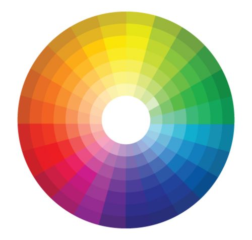
To the color wheel
If you haven’t heard of the color wheel, let me introduce you. This tool helps you decide which colors complement each other, which most certainly don’t, and those that act as the perfect accent.
A profitable note on, well, profits
Let’s talk about profits — because they matter — and website colors because they could transform your practice.
Think about what a potential client might search for when seeking help with a condition you excel in. Do you specialize in depression? Searches could include depression clinic, help for depression, depression therapist. Substitute (condition you are an expert in) and head over to Google.com Yes, now, but in a new tab so we can still chat!
Done? Now open the therapist websites on the first page or two (I know, I know, no-one looks beyond the first page of Google, so if you don’t rank on numero uno, we need to talk and soon!).
Note what you see.
Are there any sites that are an instant no?
Why? Do they look unprofessional? Thrown together? The color gaudy or overwhelming? A site could belong to the world’s top expert, the perfect therapist to help, but if it looks unprofessional, the practitioner will be viewed as their website appears. The potential client will move on.
Are there any instant yeses?
Again, ask yourself, why? Chances are part of the positive equation is the right color combined with a professional website.
I’ve listed a few sites for you to look at below. It’s important to become immersed in your perfect color finding journey and discover the finer distinctions of what works well and why…
Look at the colors. Do they:
– Complement each other?
– Create easy to read text?
– Allow you to navigate the site naturally?
– Lead you to take a specific action?
– Give you the sense this practice is modern and up-to-date; reflecting that their services are too?
– Make you want to stick around and read more, or run for the hills?
Ah, the power of colors!
As you can see, there is a great deal more to website color than meets the eye. And as a therapist, you’ll now understand the importance of implementing color therapy into your website design. We specialize in this field and have for years. It’s what we do. And when we work with you it means you can focus on what you do, because we’ve got your practice website’s back. Take a look at our portfolio of therapy website designs and view Brighter Vision websites filtered by color. I’m sure you’ll fall in love. (And between you and me, you’ll be smitten with our low price too. Shhh.)
What if your practice focuses on children? Do you gear colors towards parents I suppose?
Hi Andrea,
That’s a really great question. Yes, you would be gearing the colors towards parents but would want to keep in mind that parents are looking for a therapist for their child’s needs, not their own. Likely, a parent is looking for a therapist for their child that is friendly, warm, kind, knowledgeable…you get the point. 🙂
Think of colors that can evoke the feelings of what you think your target client would want to feel when arriving on your website.