


UPDATED! – 3 Myths About Web Design That You Need to Ditch in 2019

Every marketing professional seems to have their own opinion about what Internet myths need to be dropped going into 2019. The good news is, we’ve already made the rounds and gathered up a few reliable, data-backed suggestions for your website’s design to help you get your footing as we move forward into 2019.
–> Not sure if your website has everything it needs? <–
Test it yourself with our FREE Website Grader quiz!
3 Myths About Web Design That Don’t Belong in 2019
MYTH: You don’t need full-functionality on your mobile site

Not so long ago, there was a time when having a mobile-friendly version of your website was considered almost like an “accessory” to your main site. It was a bonus or a “plus” to your online presence, but it wasn’t seen as strictly necessary. As such, it didn’t seem so important to try and cram all of the functionality of your full site onto the smartphone version.
Then as smartphone usage skyrocketed over the years, we started to see a mobile-friendly site as a necessary courtesy, but the desktop version of your site was still seen as your “main” website and where website owners poured most of their efforts.
Nowadays, smartphones are a permanent replacement for desktop browsing for many Internet users. One out of every five adults in America only have a smartphone at home to browse the web – no broadband internet, and no desktop browsing.1 That’s over 20% of users who are completely dependent on the mobile version of your website to browse your business.
Giving your mobile visitors only a “taste” of your main desktop with limited functionality is like telling that 20% of visitors that they are not as important to you as someone with a desktop computer.
MYTH: You should be able to get anywhere in 3 clicks or less

It used to be a common belief among marketers that it was best to minimize the amount of clicks required to navigate your site as much as possible. However, recent usability studies by Ux Myths reveal that “quick” navigation isn’t as important to users as we once thought, and it’s nowhere near as important as smart navigation.2
As long as your navigation is organized intelligently so that your visitor feels that they’re getting what they expect whenever they make a click, there’s no urgent need to try and whittle down your navigation paths to 3 clicks are less.
Instead, you should focus on well-organized menus and smart hyperlink navigation. Among other things, this means using your main menu and footer menu to categorize things accurately and intuitively so people don’t have to study your site in detail to figure out how to get to their destination page. Smart hyperlink navigation includes providing links to other pages of your website when & where your site visitor would need it most. For example, providing a link to information about your therapeutic services inside the text of some of your blog posts on the same topic could help direct more potential clients towards your professional services.
–> Struggling to hook your dream client? <–
Start strategizing with our FREE Ideal Client Quiz!
MYTH: Website visitors won’t scroll automatically

We know we’ve already myth-busted the idea that all your important information needs to be in the top portion of your homepage that your visitor can see right away without scrolling (also called “above the fold”). However, this idea of needing to put all of your vital information “above the fold” seems to be the bad design trend that won’t go away.
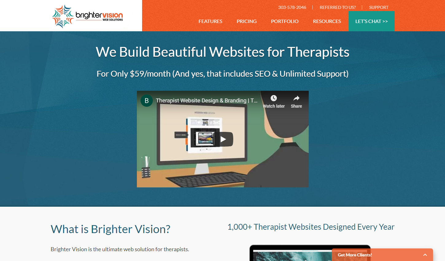
For example, this is the “above the fold” portion of BrighterVision.com
Yes, it’s still important to give your web page visitor some guiding information when they first land on your site. Letting them know the name of the site they’re on and the basic purpose are important, but you don’t need to fit your life’s story or practice’s full mission statement in the first few inches of your site.
Internet users in 2019 are already trained to scroll automatically, even without being prompted. It may make you a big apprehensive to push other important details about yourself or your business further down the page, thinking that nobody wills see them – when in fact the opposite is true. Studies have found that at least 2/3 of users’ attention is paid to content below the fold (information you would have to scroll down to read). That means it’s more important than ever to distribute your content more evenly across your web pages instead of trying to force it all to fit at the very top of the screen.
Need a beautiful new website that isn’t stuck in the past? Reach out today to the world’s best web design company for therapists, Brighter Vision, and we’ll take care of the rest. 🙂
Fill out the form below to have someone from our customer happiness team reach out to answer your questions!
SOURCES
1. “Demographics of Mobile Device Ownership and Adoption in the United States.” Pew Research Center: Internet, Science & Tech, Pew Research Center: Internet, Science & Tech, 5 Feb. 2018, www.pewinternet.org/fact-sheet/mobile/.
2. Ux Myths. “Myth #2: All Pages Should Be Accessible in 3 Clicks.” UX Myths, 1 June 2010, uxmyths.com/post/654026581/myth-all-pages-should-be-accessible-in-3-clicks.
3. Ux Myths. “Myth #3: People Don’t Scroll.” UX Myths, 1 June 2010, uxmyths.com/post/654047943/myth-people-dont-scroll.