


The Importance of a Mobile-Friendly Website
Did you know that 55% of all web traffic comes from a mobile device? Yes, most of your site’s visitors likely come from a smartphone. A device that “sees” your site differently than when viewed from a desktop. To put it bluntly, if you get this wrong you can lose over half of your visitors. Many forever. Brings a new perspective to the importance of mobile-friendly websites, doesn’t it?
So, let’s take a look at why a mobile-friendly website is key for practice success. We’ll also share how to ensure you have a website that works for both mobile and desktop. A site that attracts and converts visitors rather than pushing them away.
What does ‘mobile-friendly’ mean for websites?
Websites that are mobile-friendly — also known as having a responsive design — are specifically planned and structured to present well on a device. These sites are easy to read and navigate when viewed on a smaller screen. A non-friendly site isn’t.
See, virtually all websites can be viewed on a mobile device. Type a URL into the address bar and you can visit most sites. The term mobile-friendly has more to do with how they’re viewed on a mobile device.
Wait! You Don’t Have A Therapist Website Yet?
Brighter Vision is the ultimate marketing package for therapists, centered around the best therapist website you’ve ever had. Contact us today to get started.
A non-mobile-friendly website requires zooming and scrolling to find and read information. Text can appear too small or words can run off the page. Images are hard to see correctly. Links are difficult to find and harder to click.
A mobile-friendly web page automatically adjusts to the type of device. For example:
- The size of the text changes to fit within the screen, resizing to present an easy read
The navigation menu compresses into an easy-to-manage dropdown menu. Have you noticed the three horizontal lines that form the standard navigation menu on your phone? This “hamburger menu” is a feature of responsive design - The buttons become bigger for a more straightforward click
- It’s easy-to-navigate
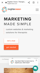
In the image below you can see how our site appears on mobile. Notice the crisp layout and how easy it is to read. The hamburger menu sits obviously at the top right, waiting to be clicked.
Are searchers using mobile devices to visit your site?
Trust us, they are. Every active site has mobile visitors.
But you’d like to know precisely how vital mobile-friendly is for your business. We’ve got you covered! Find out by connecting to Google Analytics 4 (GA4). The following three resources explain why you should connect, and how to do so.
- Why Google Analytics Is Important For Your Therapy Practice’s Success describes why understanding your website’s performance through Google Analytics provides valuable insights into your therapy practice’s online presence and helps identify areas for improvement, ultimately leading to increased success.
- How to Get Google Analytics on Your Brighter Vision Website provides step-by-step instructions for correctly setting up Google Analytics.
- If you already have Google Analytics and need to upgrade to GA4, Google Analytics 4: Prepare for the GA4 Migration walks you through the process.
View All of Your Important Marketing Data in One Place
Learn more about who’s interacting with your business online; from your website itself, to how it’s performing with search engines, to your email marketing, to social media.
Sign up for a free 14-day trial of our easy-to-use dashboard, Brighter Insights today:
Is your site mobile-friendly?
As you can see, having a mobile-friendly website is crucial. It’s essential, then, to know whether your site is responsive. There are 4 simple ways to tell.
-
Use Google’s mobile-friendly page tool
To assess a specific page, visit Google’s mobile-friendly tool and enter your URL to get a barebones assessment.
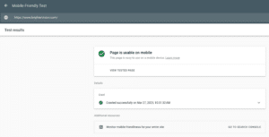
Under the title, “Is your web page mobile friendly?” enter your URL. Wait a moment. You’ll receive your answer promptly. When your page is usable on mobile, you’ll see a page like this.
-
Use your phone
Next is a more practical option. Try it!
Grab your phone and type in your URL. Does it look clear and crisp like our site? If not, it may not be responsive.
-
Use your desktop
You can also try it on your desktop.
To test your site’s responsiveness, open your website. Resize your browser window. You can do this by placing your mouse cursor over the edge of the window until the double-headed arrow cursor appears, then drag the border to reduce the window size gradually. A mobile-friendly website will automatically adapt to suit the changing screen size.
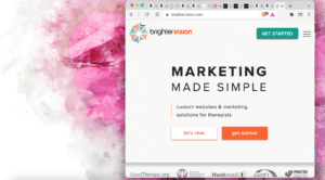
Using BrighterVision’s site, let’s see how this looks.


Even if you believe your site is mobile-friendly, confirming this is a good idea. Web designers still create sites without a view of responsiveness. You must get this right.
-
Ask us
Schedule a consultation with a member of BrighterVision’s team to discuss your site.
4 reasons that your website’s success depends on mobile-friendly
The importance of mobile-friendly websites ranges from positively affecting visitor behavior to enhancing search engine optimization (SEO), increasing conversions, to maximizing time spent on your site.
-
Encourages helpful visitor behavior
The difference between mobile and non-mobile friendly affects visitor behavior. Think with Google noted that:
- 74% of mobile users said they are more likely to return to a mobile-friendly site in the future
- 48% of users reported feeling frustrated and annoyed by non-mobile-friendly sites
- 67% said they’re more likely to buy a product or service when a site is mobile-friendly
- 61% said that if they’re unable to find what they want immediately, they leave a site
- 50% commented that they would use a liked business less often if its website is not mobile-friendly
- 36% expressed that they wasted their time by visiting non-responsive sites
A mobile-friendly website encourages visitors to engage with your content and take action, including making purchasing (and booking) decisions.
-
Supercharges SEO
Search engines favor sites with a responsive design. Mobile-first indexing is the reality. If you don’t have a mobile-friendly website, it will maim your SEO and likely diminish your search rankings.
-
Increases conversions
A mobile-friendly website can boost your success by increasing conversions, which refers to the number of visitors who take a specific action. For example:
- Clicking on an actionable button to “Schedule an Appointment”
- Pressing the click-to-call phone number
- Using geolocation to enable directions
Mobile-friendly sites that use decisive actions like these regularly see dramatic results.
At Brighter Vision, our customers see an average 28% increase in phone calls by adding the click-to-call option alone.
-
Maximizes time spent on your site
When a site is mobile-friendly, it delivers content in a way that mobile visitors want and expect. As such, they’re more likely to stay.
If your site also offers an excellent blog, resource pages, and other high-quality content, your visitors will spend more time engaged. They’ll look around and develop trust in your practice and brand.
Not sure if your website has everything it needs?
Test it yourself with our FREE Website Grader quiz!
This brings us to the next question we’re often asked…What does a mobile-responsive website look like?
There are almost endless examples. Here are three of our favs.
Examples of mobile-friendly website designs
Each of these three sites was created by our BrighterVision team for our wonderful clients. Check them out on your mobile device!
- Integrative Behavioral Health & Healing Practice
- Jenni Justice Life Coaching
- Cornerstone Counselors Mental Healthcare
Make your therapy website mobile-friendly today!
The difference between mobile-friendly and non-mobile-friendly is dramatic. A non-responsive site acts as a heavy anchor pulling your business downwards. A mobile-friendly site cuts the rode and propels your practice success upwards.
At BrighterVision, we’ve helped many therapists remove the anchor line and supercharge their practice growth. With our site-building know-how, mobile-friendly web design expertise, and intimate knowledge about what works for therapists, we look forward to helping your practice flourish.
Book your consultation by hitting “Let’s Chat” today!
Want the beautiful therapist website you deserve? Then you’re in the perfect place.
Brighter Vision is the ultimate marketing package for therapists, centered around the best therapist website you’ve ever had. Fill out the form below to learn more about our team of professionals who can’t wait to help your practice grow like never before 🙂
Ready to See How Brighter Vision Can Help You Get More Clients?